Labels

Monday 3 December 2012

Benches: 5th Shoot

My aim for this photo shoot was to look at different designs of benches as there are many different kinds situated in the area where I live. I wanted to focus on the little details in the designs of the benches or in their surroundings that make them different from each other.


As you can see, I shot the benches in many different ways to match each specific bench for example: In image 63 I chose to get close to the bench so you focus more on the texture of the wood and what's on it rather than the whole design. Whereas I chose to shoot the whole bench in image 91 as I like the composition of the window, door and bench and thought that they complimented each other nicely due to the different levels. I tried using the night time light however, I did not take much liking to this as I like to be able to see more detail in the surroundings and with doing it at night, I did not get that level of detail that I wanted. I didn't really take a shine to images 70-71 as I didn't like the fact that it was a dull concrete bench, it seemed too industrial and plain to me. 


-As the bench was in a very shaded area I increased the exposure to make the bench more visible. I was going to crop the left hand side of the frame but felt as though the bench would be to close to the edge of the frame.


-What caught my eye on this bench was the battered wooden beams as they give the impression that it has been here many years. The initials also added more interest as it shows  that it was made especially for the area.


-I increased the contrast so that the metal of the bench in the foreground was made much darker  than the brightness of the bench in the background. This makes the swirl arm of the bench more prominent.


-I focused on the arm of the bench as I was drawn to the swirl of the metal. I thought that it would be more important to focus on this aspect of the bench as this is the part of it that makes it seem slightly different.


-I increased the clarity to +70 because I wanted the cracks in the wood, highlighted by the frost, to stand out more and to make the whole photo seem more cold and gritty to suit the freezing weather conditions. I also increased the amount of black and contrast to get a dramatic difference in the colour of the wood and the frost.


- This image is more about what's on the bench rather than its design as I initially did not like it due to it's boring, ordinary design. However, when I looked closer I saw how the frost created a harsh, cold effect on the wood and that is why I chose to do a close up.


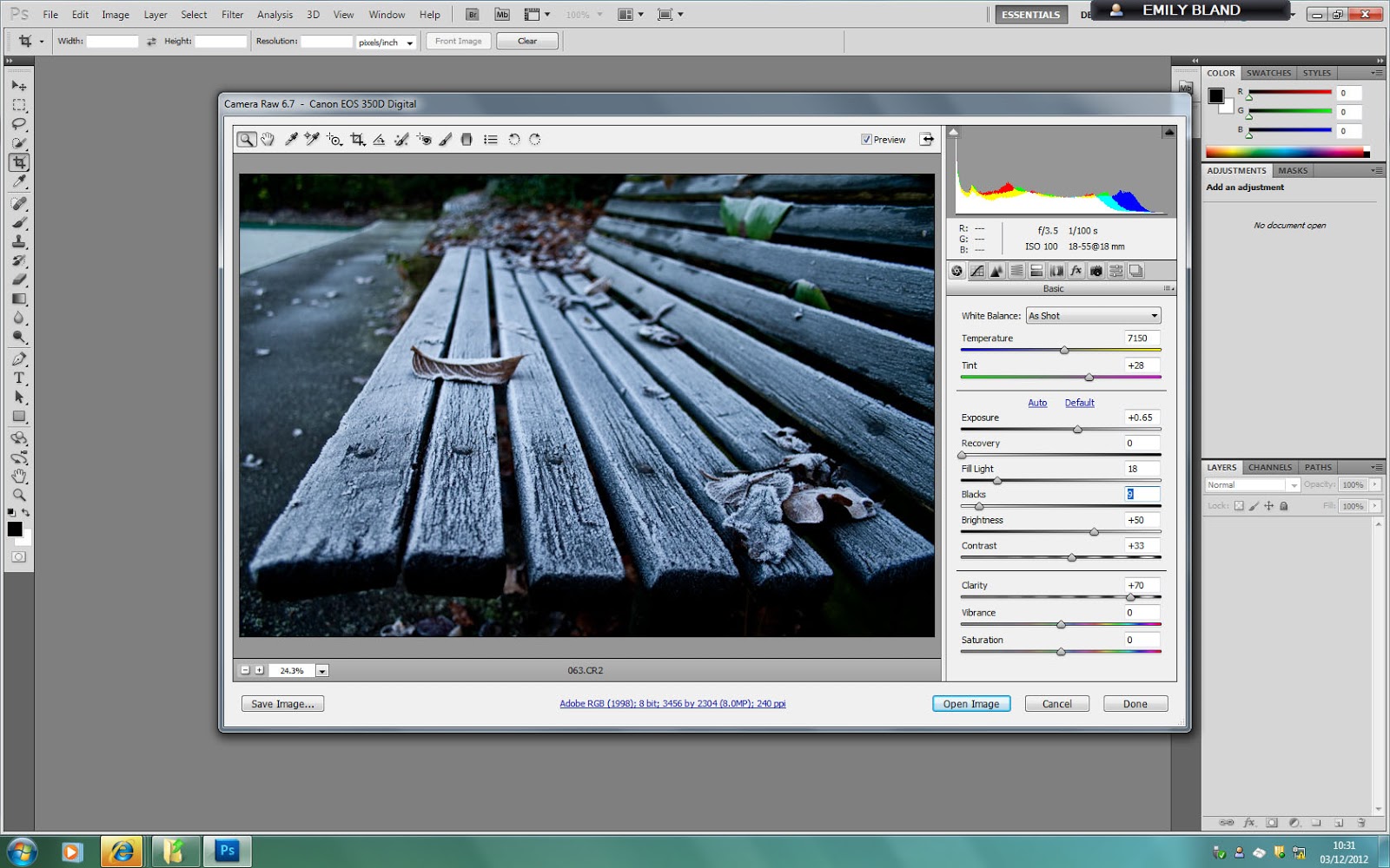
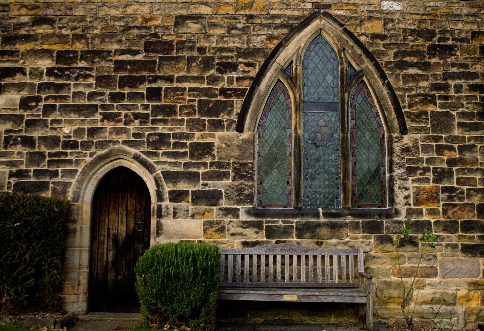
- This is one of my favourites from this shoot mainly due to the composition of the bench, door and window. I changed the warmth of the colours because I wanted the bench and the church to look quite welcoming. This also brought out the dark browns in the bricks of the church.


Monday 26 November 2012

Benches: 4th Shoot

I went in to Ilkeston town centre intending to do a full shoot however, there was a market on that took up all of the market place so I only managed to get a few images as I did not like the look of the stalls because they look quite run down.

I found it quite difficult to get take photos without having the market stalls in the frames therefore I only managed to get one decent shot which was image 165.

- I decided to change the clarity of image 165 to see what effect this would give. This is with putting the clarity level to -100 which gave a soft, almost heavenly look as there is a sort of glow around the bench.


- I also tried changing the clarity to +100, this gave a very interesting result as every detail stood out dramatically. It gave it a very gritty, rough feel and in a way that did suit the area                                       


I preferred the -100 clarity version more as it makes the figures on the fountain seem almost angel like due to the soft glow. This is a photo that I will take into consideration for my final images because I like how there is more to look at than just a standard bench alone.

Monday 12 November 2012

Benches: 3rd Shoot

Whilst in Nottingham City centre, I came across a church courtyard. This gave a very nice, pleasing setting as there were autumn leaves scattered on the floor and the church was in the background.
For me, these photos did not turn out too well as the ones that are in the courtyard are slightly out of focus. I did not like images 1-5 and 12-15 as I do not like the idea of having people in my photos because I want my photos to have the feeling that something is missing that should be there.
 
- I plan to go back to the courtyard to do another shoot as I think that the circular bench really stands out as it is very different from your average straight bench. I also think that the church in the background creates a calm atmosphere which suggests that this is a relaxing area to sit in.

Benches: 2nd Shoot

This shoot was done whilst visiting Cumbria, I didn't set out to take these however I loved the setting of Maryport harbour as it is very different to the rest of my photos as I do not live near the sea.
-Images 3 and 4 were my favourite ones due to the composition and framing of the bench with it being to the bottom right of the frames.
-I didn't really like images 9-44 because of the locations and the time of day they were taken as it was midday sunlight which gave it quite a flat look.
-Image 27 was the view from the bench in image 10. I felt as though this could be a strong image as there is quite a lot of shadow on the boats but it is bright all around. The reason I have chosen not to take this further is because I do not want to use views from benches in my final images as on a whole I don't normally find their views interesting.


BEFORE


-I chose to develop Image 4 further mainly because of the boat and the clouds. Because this port is full of fishing boats, I wanted to manipulate it in to a fairly harsh looking photo as being in the fishing industry is quite tough.


AFTER

-To get to this result I slightly increased the exposure to make the sunlight that is shining on the left of the bench brighter. Intensifying the blacks created more of a contrast between the grey and white parts of the clouds. I also toned down the saturation and vibrancy of the colours to give a weathered, harsh look. The last thing I did that I think really gives it the harsh look was increasing the clarity to the maximum to make every detail stand out for example, the chipped paint on the railings is much more pronounced.


Sunday 11 November 2012

Bernd & Hilla Becher

Bernd and Hilla Becher were German artist that worked together, photographing industrial structures is what they were most famous for.


-You could say that their work is very much objective as they have a strong focus on their subject instead of incorporating more of its surroundings. I think that by doing that they have created some beautiful photographs as it makes you notice and really see buildings and structures that we would normally not even look twice at.
-They liked to shoot on cloudy days so that the appearance of the structures/buildings were not heavily manipulated by bright light. With keeping up that idea of shooting in the same light, Bernd and Hilla Becher have produced some very strong images such as 'Water Towers'.

Water Towers
The way that this collection is displayed is quite striking as they are displayed side by side showing the blatant differences in the structure design. However, it also shows the similarities and that is that each tower is unique.

The way in which the Becher's worked has urged me to make a bigger deal on the designs of the benches that I shoot as they come in various different designs that generally have been made to suit the locations they are situated.


-This series of photos from The British Journal Of Photography magazine (March 2005) has made me think of also taking location in to account more as this can change the character of a particular bench and the entire feel of the photograph.
-I managed to make out from the left handside of the page that the photographer was influenced by Bernd & Hilla Becher too as it is very clear as to what her project is about.


Monday 5 November 2012

Benches: 1st Shoot

I went on this shoot with the work of Anthony Hopewell in mind. His works on benches incorporated quite a few memorial benches and their views. He displayed the photo of the bench and its view side by side however, I had the idea that I would add one more aspect to the display of photos which would be the memorial plaque itself.


These photos were taken in a park and a cemetery and I found that the setting was too similar, the lack of variation of the design of the benches and the setting made it an incredibly dull shoot to do. Images 5-8 are the view from one particular bench and because there is not much to look at I would not consider using any of these for my final images as they are very boring to me.

-Image 73 (seen left) is one that did stand out to me most but it was mostly for the sections of the wood on the bench and the way they travelled across the frame. This is what I would like to carry over to my future shoots because I think that only photographing part of a bench can work very well in some cases when trying to approach this theme in a more artistic way.


By looking at the contact sheets I felt that the concept of memorial benches was quite restricted and bland as I like to look at the benches from different angles and portray them in a more artistic and abstract way. I want to create images that are pleasing to the eye rather than looking plain but having more of a story behind them.


Tuesday 16 October 2012

Change Of Unit 3 Topic

Due to simply not having the passion for low light landscape photography, I have decided to go in the direction of benches. I believe they are a very strong and important part of our surroundings as everybody uses benches in their everyday lives. And as you can see here, I was drawn to photographing benches on what were supposed to be low light landscape shoots.


I have chosen to explore the topic of memorial benches and by doing so I came across the works of Anthony Hopewell: Memento Mori.

This is a collection of photographs based on the topic of memorial benches. He focuses on the absence, memories and loss of loved ones and friends that are no longer with us.

"The bench’s location is often symbolically important, either to the deceased, or to their family or friends, but ultimately the location is dictated by permission from the local authority. This inevitably results in a variety of settings, some more appropriate than others."

His main focus was on the benches location which is something that I need to take into consideration if I were to make the focus of my coursework on memorial benches. This was also a landscape project as the view from the becnch was just as important as the bench itself. The location is supposed to portray an individual identity and history about the person that the bench is dedicated to.

His work really does seem as though it is focusing on phantoms and of the absence of people that once lived. This collection in a way does the same job as the benches themselves as it is displaying the memory of certain people.


Monday 15 October 2012

Low Light: 2nd Shoot

For my second low light shoot, I was aiming to shoot in early evening light so it wasn't dark but so there were a lot of dark areas within the woods. However the shoot didn't go as well as I had planned due to my lack of interest within the topic and so I found myself taking photos of objects rather than landscape, the majority of them being of benches.
             

 -I immediately discarded images 893-913 due to the fact that they seemed very dull and empty, not in the sense of content but the feelings that they emit. Images 911-913 were more of a composition issue with me as i didn't like the way the bench was almost on a slant on the ground and so it became wonky within the frame.
-I chose to take 933 further and do some editing on it. To produce this image I had to lower the tripod as much as I could and lie on the ground in order to achieve this low angle shot. I created the strong sense of importance that I was aiming for as Low angle shots are generally used to portray power.
-Images 946-950 didn't turn out as well as I had expected and it was probably because it was difficult shooting them as I had to climb up a tree and try to steady my tripod on some branches in fairly strong winds.  
-I took a shine towards the Orchard sign because it is so unique in todays age to see something like that. 953 stood out the most to me as you have the brightness of the fields, trees and sky in the background and the subtle orange/red of the apple on the sign in the foreground.
-968 is one of my favourites because of the framing. I like how the picnic table is half hidden away behind the arch so it looks like quite a private and quiet area.


-I wanted to increase the warmth of the wooden bench so I heightened the colour temperature.
-To really make the bench stand out, I increased the shadows so the background was much darker.
-I felt that it still needed an extra bit of warmth so I gave it a 1960's effect which created a type of hazy, brown film of the top.


-To create this final image, I darkened the edges slightly and increased the saturation of the colours to intensify them slightly.
-I believe that by making the bench stand out more and with it being taken at a low angle, I have heightened the fact that it is of some form of importance.


-Because the colouring of the wood for the apple had faded, I saturated it to make it more prominent as the carving of the apple is a key element in showing people what an orchard is. 
-By intensifying the blacks in the image, it has made the word 'ORCHARD' much clearer and easier to read.
-I am fairly happy with the composition, however I think that it would have worked better if the whole of the sign was in the frame with the orchard blurred in the background rather than a normal field.  


-For this image I wanted to bring out the colours in the red leaves and the moss that is growing up and around the arch of this tea room. First I increased the colour temperature so that the red leaves had more of a warm glow to them and darkened the shadows so it seems like the bench is even more hidden away.


-To achieve the final image, I upped the saturation of the colours in order to intensify the reds and greens more.
-I do like the end result but find that the area around the arch window could have used less colour saturation as it looks slightly too yellow.


Wednesday 10 October 2012

Low Light: 1st Shoot


In this shoot I intended to capture the orange and reds of the sun setting over the woods of Shipley Park with the initial idea of them being fairly warm looking images.


-Having had done some research into different approaches to 'Low Light' photography, I did a shoot in Shipley Park using the setting sun as my low light source.
-I quite liked image 58 for the composition of the tree and the sun just behind it's trunk however, it wasn't striking enough for me and lacked the orange colours of a sunset.
-Images 62-64 stood out more than most of the other tree photos due to the bright, burnt orange light shining on the trunk of the tree in the foreground.
-Image 82 is the most effective in my opinion as you have the deep red plant growing up the building in the background and the orange/brown colour of the bench in the foreground. These two colours work really well together and could look even more effective if they were intensified.


-Because I wanted to bring out the colours in the bench and the plant growing up the building, I saturated them making them more vibrant. But with having increased the colour temperature, the colours would have been to bright so I toned down the saturation a little.


 -To produce the final image I darkened the edges of the photo to create more of a focus on the bench as I was aiming for it to seem fairly lonely and sad.


-I intensified the orange sun light as that is what makes this image. By darkening the shadows it has allowed us to see the different shades of the bark on the tree in the foreground, giving it more depth and is more interesting to the eye.


Exploration In To Theme: Low Light

This Photo was taken at night by John Ryan, it is very much to my liking as it is in an ordinary setting that has been manipulated to seem quite cold and sinister. I like the composition of the bench as it is made to seem lonely with so much open space in front of it. Because it is a memorial bench, it has the feeling as though somebody is on the bench even though nobody is there and this to me creates a sense of curiosity about who it is dedicated to. 


 This is another striking photo, however I find this to be quite eerie especially as a bus like this is supposed to have lots of people on it and with it being empty, it seems creepy. I like the way the street lighting looks misty, that for me is what makes this photo interesting.


I find this photo by Martin Stranka to be very striking. Even though the main subject is very small, you are instantly drawn to it due to the harsh lighting that is in front which creates a bleak atmosphere. The dark, blank space around it again portrays a strong sense of loneliness which I find is quite chilling.

Brassai

-The Hungarian photographer, George Brassai, rose to fame during the 20th century in France. He made his stamp on the world of photography with his 1933 book, Paris de Nuit. He was very attracted to the contrast between the artificial lighting of the city and the areas of darkness where the light could not reach.
- He often used the natural effects of fog and rain to capture the thriving city of Paris at night, this later caught on with many other photographers and is seen in a lot of low light/night photography today. For example, The photo above by Martin Stranka.

- I find this particular photo from Brassai slightly amusing in a way as the sign on the lamp post is showing a footpath which leads in to the darkness. I love how the light surrounding the lamp post and the brightness of the wall behind it looks like it belongs in a safe place, whereas the white door between the bricks seems a little mysterious and dark which matches it's actual physicality.

I have decided to base my unit 3 on Low Light Landscape photography with using natural evening light.