Labels

Saturday 2 February 2013

Final Images

When choosing my images, I had to take into consideration what photos linked and worked well together. My aim was to portray different benches in a way that would display how their design suits the environment that they are placed in.  For example: The first two photos are very basic and have a modern feel to them as they are part of a modern, cosmopolitan city (Nottingham).

I felt that it was the simplicity in these two images that makes them what they are, the cigarette stub in the photo on the left adds more character to the bench. Whereas the image on the right has the Council house behind it which clearly displays its location. I was torn between these two but decided to use both in my final images.

This made it in to my final images due to the detail in the wood and the few snowflakes that are in the handle. This also gives a simple, contemporary feel as the stone is very practical for a City centre.


I chose this one mainly because of the initials 'EBC' (Erewash Borough Council) as this is in a place nearby (Ilkeston) that I have been to my whole life. I also liked how you can clearly see that this bench has been there for many years as the age really shows in the wood.


It was the way that frost displayed the cracks and dents in the planks of wood that made this a final image. The white frost gave a great winter feel and toning down the colour temperature of the image enhanced this.


This was going to be one of my final images even before I shot it due to the composition of the window, door and bench and the warm brown colour on the bricks of the church. I didn't feel the need to do a close up of this bench like I did with the majority of the other benches as the design is clear from this distance and having the window and door around it gives the image a little more substance rather than it just being of a wooden bench.


As my other final images had very basic bench designs, I chose this for the swirly metal work. I think that this creates an quaint, 'olde-worlde' feel, it's this that drew me towards the bench and not the location unlike the other benches.


I incorporated this photo purely down to the location as this was taken in the area of Maryport, Cumbria that I regularly visit due to family. The gritty, rugged vibes I get from this image match the location exactly as there are many old, and some tatty, fishing boats in this dock. I thought the grey stone of the bench matched the rugged location perfectly. 


This almost did not make it in to my final images as but it is my favourite in terms of the angle that it was shot in. The low angle creates the idea of importance and dominance as it seems as though it has some form of higher power as we appear to be looking up at the bench.


This one was picked as I believe that this is the bench that suits its location the most as it is made from the same sort of rack that is lying in the river nearby so it fits in so well. It's simple design doesn't make it stand out and look out of place in the very natural environment.

I decided to use window mounts to display my final photos because it gives a neat and tidy finish to my work. The white edging around the photos helps set them off nicely and draws the viewers eyes in to the photos.
  I started off my project exploring 'Low Light' photography but found that it was not the topic for me. Because I was naturally drawn to taking photos of benches, I wanted to display the different designs of benches and show the aspects of the benches that made them what they are, for example: a handle or wood carvings.
  I feel as though I have achieved this goal with the final images that I have chosen as the way that they have been shot match the bench and show what is needed to be shown of their environment.

Thursday 31 January 2013

Benches: 7th Shoot

After my last shoot in Nottingham City Centre, I wanted to go back and take some photos in some better weather. I wanted to see if the added colour of the sky would improve the look of the benches and the feel of the surroundings as there were much less people around in my previous shoot due to freezing weather conditions.


- Overall I found this shoot quite difficult in trying to find different designs of benches as many of them were the same brushed chrome benches. Images 50-53 and 59-65 are of the same sort however, I think that 59-65 display the design in a much better way as you can see both the main part of the bench and the detail on the side.
-I thought about the concrete slabs in Trinity Square (images 74-81) that are used for people to sit on but I did not like the outcome as slabs is all that they looked like. 
- I went back to taking photos of the long wooden bench in the Market square (images 82-91) as I wanted to see if the weather made a difference in the feel of the images. I was particularly fond of Image 84 mainly because you are able to see the Council House in the background, making the location identifiable.
- As I did not take my tripod out with me, I had to under expose images 0-10 and make sure that I increase the exposure in post production.
- Image 11 is a photo that was taken on holiday in France, as soon as I saw it I knew that it would fit perfectly with my coursework as the bench suits its surroundings very well.


BEFORE
-I chose to develop this further because I really liked the curved back and the logo that appears on the top left of the bench. It's location played a part in why I like it so much too as this is a very busy shopping street so you don't get the feel of absence because of the shoppers in the background.


AFTER
- I did not want to manipulate this photo massively as I like the original however, I felt as though the shadows on the curved back needed to be that little bit brighter. So I increased the exposure and toned down the blacks.


BEFORE
- This was my favourite from the photos of this particular bench purely because of the location. Unlike many of my other photographs, you are able to put a name to where this bench is due to the Council House in the background.


AFTER
- I wanted to enhance the brightness of the image to reflect the weather conditions so I slightly increased the exposure and added vibrancy so that the sky and signs on the council house stood out more.


BEFORE

- Due to not having a tripod with me, I had to under expose some images as they were taken indoors. This bench caught my eye straight away with it's pretty, swirly metal work. I was also drawn to it's tattered, decrepit appearance. The mirror behind is another factor that made me take this image as it fits perfectly with the old look that is trying to be created with this bench. I favoured this angle more than the others because the low angle portrays the bench in a way that makes it seem as though it has some form of importance.


AFTER
- The first thing I did was increase the exposure and add more brightness so that the wallpaper was quite bright. I wanted there to be a strong contrast between the darkness of the shadows and everything else so I heightened the contrast a little. Because I increased the vibrancy so that the green ivy stood out more, I had to decrease the saturation as the bench ended up being a garish yellow and I wanted it to stay beige.


BEFORE
- This is one of my favourite photos of my entire collection of photos as everything about it screams nature. The moss on the stone bench is the first thing that caught my eye, this really shows that it is a part of the scenery. 


AFTER
- I wanted to make the texture of the stone stand out a little bit more so I increased the clarity to 23. This is definitely a contender for my final images as it looks on the design of the bench but you are also able to clearly see it's location.


Friday 25 January 2013

Benches: 6th Shoot

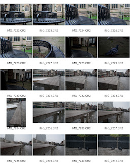
I decided to go back in to Nottingham City Centre as there are some quite unusual types of benches there that some may not automatically are benches due to their design. My intention was to focus on little details rather than the subject as a whole because I wanted to look at the textures of wood or the metal work.


-I immediately discarded images 22-30 because I was not particularly fond of the design, it also seemed too plain and boring to me. 
-Images 31-33 caught my eye straight away. When I was taking these photos, I was not too sure on whether I would like the content due to the cigarette stub on the bench. However, I think that this gives it more of a used feel, making it clear that people do use the bench.
-I was torn between images 46 & 47 because I loved the detail of the wooden handle against the brushed chrome but I was drawn slightly more towards image 47 as it was more zoomed in on the handle and it took up more of the frame than image 46 did.
-Overall, I think that I have got two images that have the potential to be in my final images from this shoot.


BEFORE

-This photo was my favourite out of images 33-31 as you get to see the detail of the wood very clearly in the foreground. I shot it so it you are made to look all the way to the end of the bench so you are able to get an idea of how big it actually is. I decided to made the foreground in focus because I wanted the texture and cracks in the wood to be very clear. 


AFTER
- I decided that I needed to increase the exposure in order to be able to see the underneath of the bench better. Another key decision I made was to increase the vibrancy of the colours so that the blurred shop signs and the cigarette stub were more vivid. This also added more brightness as there is a lot of the same colours in this photo such as the bench, floor and the buildings. By increasing the clarity of the photo, the detail of the wood was made more prominent.


BEFORE

- I chose to develop this image further because It shows the whole of the bench but focuses greatly on the design of the handle and this is what drew me to it in the first place. Just like the photo above, I was interested in the detail of the wood and the outdoor, weathered look.


AFTER
- Again the exposure was the first thing that had to be increased but on this photo I heightened the colour temperature slightly so the wood didn't end up looking totally grey. Because my intention was to look at detail on benches in this shoot, I increased the clarity to 100 to enhance the weathered look of the wood.