For my second low light shoot, I was aiming to shoot in early evening light so it wasn't dark but so there were a lot of dark areas within the woods. However the shoot didn't go as well as I had planned due to my lack of interest within the topic and so I found myself taking photos of objects rather than landscape, the majority of them being of benches.
-I immediately discarded images 893-913 due to the fact that they seemed very dull and empty, not in the sense of content but the feelings that they emit. Images 911-913 were more of a composition issue with me as i didn't like the way the bench was almost on a slant on the ground and so it became wonky within the frame.
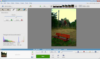
-I chose to take 933 further and do some editing on it. To produce this image I had to lower the tripod as much as I could and lie on the ground in order to achieve this low angle shot. I created the strong sense of importance that I was aiming for as Low angle shots are generally used to portray power.
-Images 946-950 didn't turn out as well as I had expected and it was probably because it was difficult shooting them as I had to climb up a tree and try to steady my tripod on some branches in fairly strong winds.
-I took a shine towards the Orchard sign because it is so unique in todays age to see something like that. 953 stood out the most to me as you have the brightness of the fields, trees and sky in the background and the subtle orange/red of the apple on the sign in the foreground.
-968 is one of my favourites because of the framing. I like how the picnic table is half hidden away behind the arch so it looks like quite a private and quiet area.
-I wanted to increase the warmth of the wooden bench so I heightened the colour temperature.
-To really make the bench stand out, I increased the shadows so the background was much darker.
-I felt that it still needed an extra bit of warmth so I gave it a 1960's effect which created a type of hazy, brown film of the top.
 -To create this final image, I darkened the edges slightly and increased the saturation of the colours to intensify them slightly.
-I believe that by making the bench stand out more and with it being taken at a low angle, I have heightened the fact that it is of some form of importance.
-Because the colouring of the wood for the apple had faded, I saturated it to make it more prominent as the carving of the apple is a key element in showing people what an orchard is.
-By intensifying the blacks in the image, it has made the word 'ORCHARD' much clearer and easier to read.
-I am fairly happy with the composition, however I think that it would have worked better if the whole of the sign was in the frame with the orchard blurred in the background rather than a normal field.
-For this image I wanted to bring out the colours in the red leaves and the moss that is growing up and around the arch of this tea room. First I increased the colour temperature so that the red leaves had more of a warm glow to them and darkened the shadows so it seems like the bench is even more hidden away.

-To achieve the final image, I upped the saturation of the colours in order to intensify the reds and greens more.
-I do like the end result but find that the area around the arch window could have used less colour saturation as it looks slightly too yellow.
 This is a collection of photographs based on the topic of memorial benches. He focuses on the absence, memories and loss of loved ones and friends that are no longer with us.


